
15 Years of Real Expertise. A Brand That Showed None of It.Brand Identity & Positioning for an Established Professional Services Firm
The firm had been operating for fifteen years. In that time, they had built a client roster that included regional corporates, family offices, and high-net-worth individuals. Their work was sophisticated. Their client relationships were deep and long-standing. Their referral rate was high. And yet, when a prospective client encountered the brand for the first time — the website, the proposal document, the business card — none of that came through. What came through was ordinary. Conservative in a way that did not read as trustworthy but as dated. The firm was leaving credibility on the table at the exact moment when credibility mattered most. They came to us not because they were struggling commercially but because they were preparing for a growth phase — adding new service lines, expanding geographically, and competing for a tier of client they had not historically targeted. For that, the brand needed to work much harder.
2026
Timeline
Strategy
Category
The Challenge
The Gap Between Perception and Reality The brand was communicating stability and tradition, which are not bad things. But it was not communicating expertise, rigour, or the kind of quiet confidence that senior decision-makers respond to when they are considering who to trust with complex financial matters. Proposals were formatted differently depending on who had produced them. The website was three updates behind. Printed materials used different fonts and color variations across documents. For a firm whose core value proposition is precision and reliability, this visual inconsistency was a contradiction they could not afford. In 2024, a professional services firm's digital presence is part of the due diligence process. Prospects Google before they call. The existing website provided almost no reason for a high-quality prospect to stay, trust, or reach out.


Brand Communicated the Wrong Things
No Cohesive System
Digital Presence Was an Afterthought


Strategy & Execution
Our Approach
Brand Positioning
Through stakeholder interviews and competitive mapping, we identified a positioning territory that was specific and defensible: forensic clarity in complex financial matters. Not broad expertise. Not comprehensive service. Forensic clarity. This became the lens through which every brand decision was made.
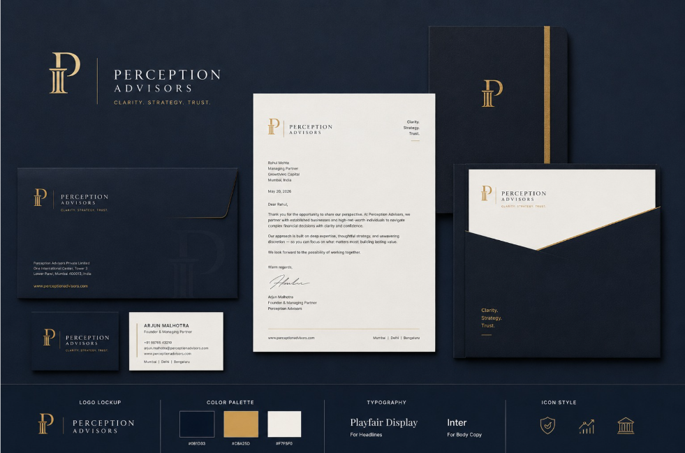
Visual Identity System
We designed a refined logo mark that retained a visual continuity with the firm's history while stepping it clearly into the present. Deep navy, warm white, and a precise gold accent formed the core palette — sophisticated, trust-signalling, and visually distinct from the default grey-and-blue palette that dominates the category.
Collateral System
We designed a complete collateral system: proposal templates, presentation decks, business card system, letterhead, and a set of digital assets. Every element was built to the same standard and documented in a brand guide that the firm's internal team could use independently.
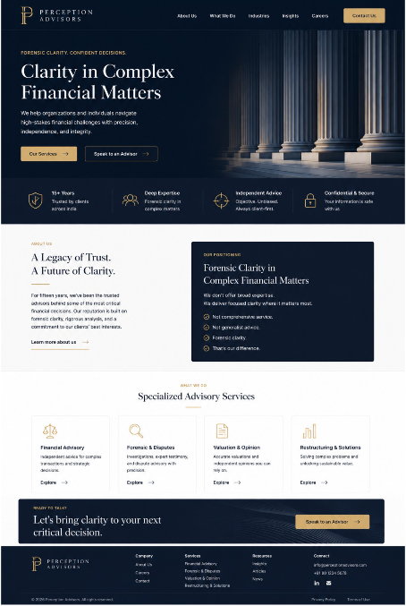
Website Overhaul
The website was restructured with a single purpose: to move a qualified prospect from first visit to a conversation. Service pages were rewritten to be specific and outcome-oriented. The team section was rebuilt around individual expertise rather than generic bios. The contact experience was simplified to a single, low-friction entry point.
Insight 01

Insight 02
The Results

Improved
Website Inquiry Quality
Within six months, the team noted that inbound inquiries were coming from a more sophisticated prospect profile — larger entities, more complex requirements, higher potential contract values.

Increased
Proposal Conversion Rate
With consistent, premium proposal templates, the firm began converting at a higher rate on new business pitches.
Strengthened
Internal Team Cohesion
Staff began using the new materials proactively, referencing the brand guidelines, and producing on-brand content without prompting. Brand pride is a real business asset.
The Impact
Higher Quality Inbound Leads
Inbound inquiries were coming from a more sophisticated prospect profile — larger entities, more complex requirements, higher potential contract values.
Improved Proposal Performance
The firm began converting at a higher rate on new business pitches.
Enhanced Market Authority
The rebrand helped communicate authority independently rather than relying solely on word-of-mouth reputation.
Astrongbranddoesnotcreateexpertise.Butitmakesexpertisevisible.Forthisfirm,therebrandwasthedifferencebetweentheirreputationexistingonlyinword-of-mouthandbeginningtoexistineveryinteractiontheyhadwiththemarket.Thatreach—fromreferrals-onlytoabrandthatcommunicatesauthorityonitsown—iscommerciallymeaningfulateverystageofgrowth.
Behind Every Great Strategy,
There’s a Great Team.


Let's Construct
Future.
Ready to scale? Drop us a line.