The Problem With Looking Like Everyone ElseBrand Identity & Visual System for a Fast-Growing Technology Startup
When this technology startup came to us, they had been operating for two years. They had a working product, paying customers, and a sales pipeline that was starting to pick up momentum. What they did not have was a brand that matched the ambition behind the business. Their existing visual identity had been put together in the early days — a logo from a freelancer, a website with a generic tech theme, and marketing materials that could have belonged to any of the two hundred other SaaS companies in the same space. When prospects visited their website or saw a proposal deck, there was nothing that said this company is different. There was nothing memorable. Nothing that made you want to lean in. The founder described it plainly in our first call: our product is better than most of our competitors, but we do not look like it. That was the brief.
2026
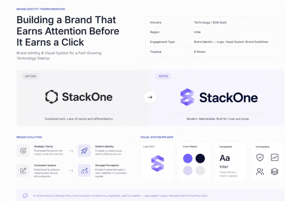
Timeline
Strategy
Category
The Challenge
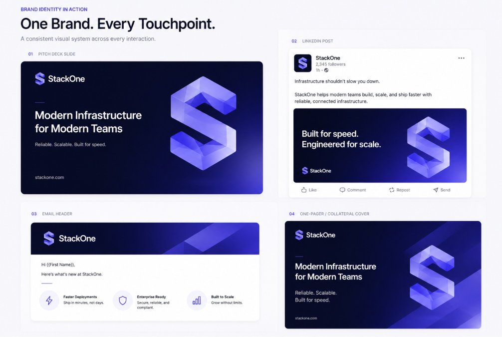
What We Were Actually Solving In a crowded B2B technology market, looking generic is an active liability. Prospects make quick judgments. If the brand does not communicate confidence, capability, and intentionality in the first few seconds, it is competing purely on price and features — a race most companies lose eventually. The company's visual language varied depending on who had created what. The website looked different from the deck. The deck looked different from the social content. There was no system, which meant every new piece of collateral required starting from scratch, which cost time, and still produced inconsistent output. The product itself was genuinely well-built — clean UI, thoughtful workflows, strong performance. The brand felt like it had been built by different people with a different set of standards. This mismatch was not invisible to prospects. Trust is built across every interaction, and a weak brand surface erodes the trust a strong product tries to build.

No Differentiated Visual Identity
Inconsistency Across Touchpoints
Brand Did Not Reflect Product Quality
Strategy & Execution
Our Approach
Strategic Discovery
We spent the first week and a half in structured discovery — understanding the competitive landscape, mapping how the target audience thought about the problem the product solved, and identifying the specific position in the market that was both true to the company and unoccupied by competitors.
Positioning Strategy
What emerged from that process was a positioning direction built around precision and reliability. Not innovation for its own sake — precision in execution, reliability in outcomes
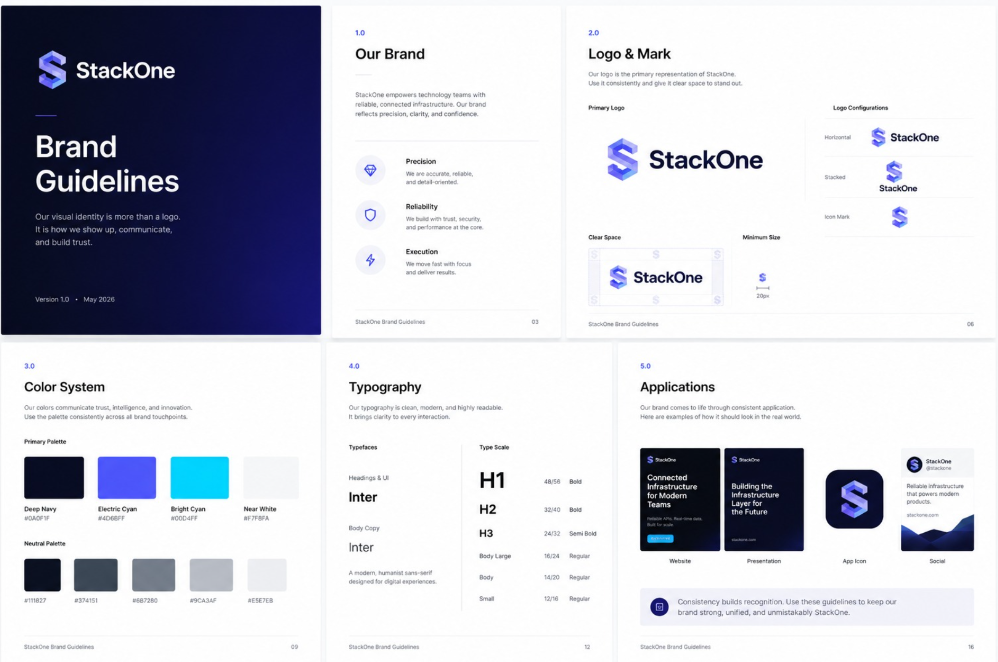
Logo & Mark Design
We designed a primary logo system with three configurations — horizontal, stacked, and icon mark — each optimized for specific use contexts.
Color System Development
We moved away from the default blue-on-white palette and developed a system with a primary deep navy, a precise electric cyan accent, and a warm near-white background tone.
Typography Framework
A two-typeface system — one geometric sans for headlines and UI elements, one humanist sans for body copy and long-form content.
Brand Guidelines Creation
Everything was packaged into a 40-page brand guidelines document covering logo usage rules, color codes, typography hierarchy, iconography style, photography direction, tone of voice, and usage examples across key touchpoints.

Insight 01

Insight 02
The Results

Improved
Proposal Win Rate Improved in 90 Days
The conversion rate from proposal to signed contract increased in the three months following the rebrand rollout.

Accelerated
Investor Conversations
Two investor relationships that had been lukewarm accelerated meaningfully after the updated materials were shared.
Increased
Internal Confidence
The team started sharing company materials more proactively and sales reps stopped apologizing for the deck before sending it.
Reduced
Design Overhead
Brand consistency reduced turnaround time on marketing collateral and freed creative resources for higher-value work.
The Impact
Increased Proposal Conversions
Proposal-to-contract conversion rate improved after rebrand rollout.
Stronger Investor Engagement
Investor conversations progressed more effectively after brand refresh.
Improved Team Confidence
Reduced turnaround time on marketing collateral creation.
Better Resource Allocation
Creative resources were freed for higher-value strategic work.
Brandingisnotdecoration.Itisthefirstargumentyourbusinessmakesaboutitselfbeforeanyonereadsawordofyourcopyorusesafeatureofyourproduct.Forthiscompany,theinvestmentinaconsidered,strategicallygroundedbrandidentitydirectlyinfluencedcommercialoutcomes—insales,infundraising,andinhowtheteamshowedup. Theworkpaidforitselfwithinaquarter.
Behind Every Great Strategy,
There’s a Great Team.


Let's Construct
Future.
Ready to scale? Drop us a line.